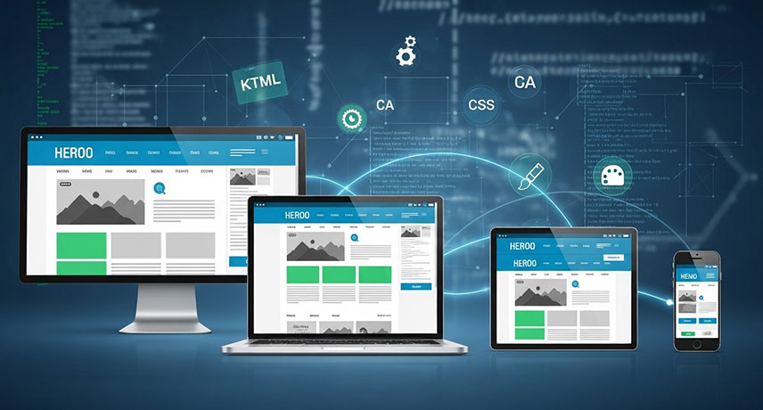
Responsive Website
In today's multi-device world, your website needs to adapt seamlessly to every screen size. Our responsive design ensures your content looks and functions flawlessly on desktops, laptops, tablets, and smartphones. Say goodbye to awkward zooming and scrolling – we deliver an optimal viewing experience for every visitor, no matter how they access your site. Reach more people, engage them effectively, and make a lasting impression with a website that responds.
Frustrated users are lost users. A responsive website prioritizes user experience by providing a consistent and intuitive interface across all devices. This means easy navigation, readable text, and engaging visuals, whether your audience is on a large monitor or a small mobile screen. By investing in a responsive design, you're investing in user satisfaction, which leads to increased engagement, conversions, and ultimately, business growth.
Why Choose The Service
-
 Your website: Looks amazing, everywhere
-
Happy visitors, on any device.
-
Ready for tomorrow's screens, today.
-
One website, infinite screens.
-
More reach, better results.
-
Increased engagement, improved SEO rankings.
-
Consistent brand experience across all platforms.